Easy High School Art Lesson Butterfly on Toned Paper in 3 Easy Steps!
Hey there, fellow art enthusiasts! Excited to have you back in our creative corner. Today, we’re diving into a super cool topic – High School Art Lesson Butterfly on Toned Paper.
Prepare for a journey of artistic enrichment as we explore the specifics of this art project. I’m not just here to guide you through the introduction of the lesson; I’m excited to share valuable tips and tricks that have been refined through my experiences in the classroom. Learn about the techniques that work seamlessly and gain insights that elevate the success of this artistic endeavor. By following these carefully outlined steps, both you and your students will have the opportunity to produce remarkable compositions that beautifully merge the finesse of colored pencil techniques with the distinctive canvas of gray paper.
Step One: Lightly Sketching the Butterfly on Toned Paper
In this first step of the art lesson, your task is to start the butterfly drawing by creating a light sketch on tan or gray-toned paper using a pencil. This preliminary sketch serves as the foundation for the entire drawing, helping you establish the butterfly’s shape and its accurate placement on the paper.
Common challenges for students in this step include achieving proper proportion and symmetry. Beginners often struggle to create a butterfly shape that is balanced on both sides, leading to uneven or distorted results. Another challenge is the tendency to press too hard with the pencil, resulting in dark, hard-to-erase lines that can interfere with the final drawing. Additionally, finding the right balance between adding enough detail without overwhelming the initial sketch can be a hurdle for beginners.
For art teachers, it’s crucial to encourage students to start with a very light touch when sketching the butterfly’s basic shape. Emphasize the importance of symmetry, providing tools like rulers or the folding method to ensure both sides match. Offering reference materials that can assist students in grasping the fundamental butterfly shape and proportions during the sketching phase.
Students are advised to begin with the lightest possible pencil strokes, treating this stage as a rough draft that can be refined later. Taking time to ensure symmetry through checks like folding the paper or visual comparison is essential. At this stage, the focus should be on capturing the basic shape and proportions of the butterfly, leaving finer details for later steps.
Step 2: Building Dark and Light Values with Colored Pencils
In this step, you’ll progress from the initial sketch to infusing depth and dimension into your butterfly drawing. The key to achieving this lies in using black and white colored pencils on the toned paper, creating a stark contrast between dark and light values that will breathe life into your butterfly.
Common challenges for students in this step include the risk of overblending, where the accidental mixing of black and white colored pencils results in a gray, muddy appearance that can flatten the image. Maintaining consistent and light pressure during the layering process poses another challenge, as uneven shading and an unbalanced look can result from inconsistent pressure. Additionally, incorrectly placing darker values next to lighter ones can distort the overall contrast and shape of the butterfly, diminishing its realism.
For art teachers, it’s vital to instruct students on using short strokes and light pressure with both black and white colored pencils to prevent overblending. Visual examples or demonstrations can effectively showcase the undesired outcomes of overblending, emphasizing the importance of keeping the black and white colors separate. Teachers should also explain the significance of correct value placement for creating the illusion of depth and form, utilizing references or visual aids to illustrate how values impact the appearance of objects.
Students should start by sharpening colored pencils to a fine point for precision and controlled application. Begin layering black pencil in areas requiring darker values, gradually building up darkness. Use the white colored pencil for lighter areas or highlights, applying it with light pressure. To avoid heavy blending between black and white pencils, allow them to overlap gradually, creating smooth transitions between dark and light areas. Frequent comparison of your drawing with the reference image ensures accurate value placement relative to the subject, while noting subtle variations in light and shadow.
Step 3: Creating the Backgroundto Complement the Butterfly Subject
The objective here is to craft a background that not only complements the butterfly but also adds depth and atmosphere to the overall composition.
Common challenges for students in this step include the risk of overworking the background, adding excessive detail or shading that may overpower the main subject, the butterfly, resulting in a visually cluttered drawing. Achieving consistent background values and a smooth transition from the butterfly to the background can be tricky, with sudden or harsh changes in tone disrupting the flow of the artwork. Patience is crucial in this step, as rushing may lead to uneven background shading and a less appealing composition.
For art teachers, it’s essential to stress that the background should complement, not overshadow, the main subject, encouraging students to consider the overall balance of the composition. Teach them to start with a lighter background and gradually build up layers to achieve the desired depth and atmosphere. Demonstrating how to blend the background smoothly into the toned paper and create gentle transitions helps students avoid abrupt changes in tone that can distract from the butterfly.
Begin by lightly sketching the outline of the butterfly’s shape on the background, serving as a guide for a clean transition between the subject and the background. Apply background shading with light pressure initially, as it’s easier to add darkness than to lighten an area that has become too dark. Working in layers helps achieve a smooth transition and depth, requiring patience in this step. When blending the background, do so gently into the toned paper to avoid harsh lines. Periodically stepping back to assess progress ensures that the background enhances the butterfly without overwhelming it, keeping the butterfly as the focal point of the drawing. Remember, the background’s role is to provide context and atmosphere, enhancing the overall composition.
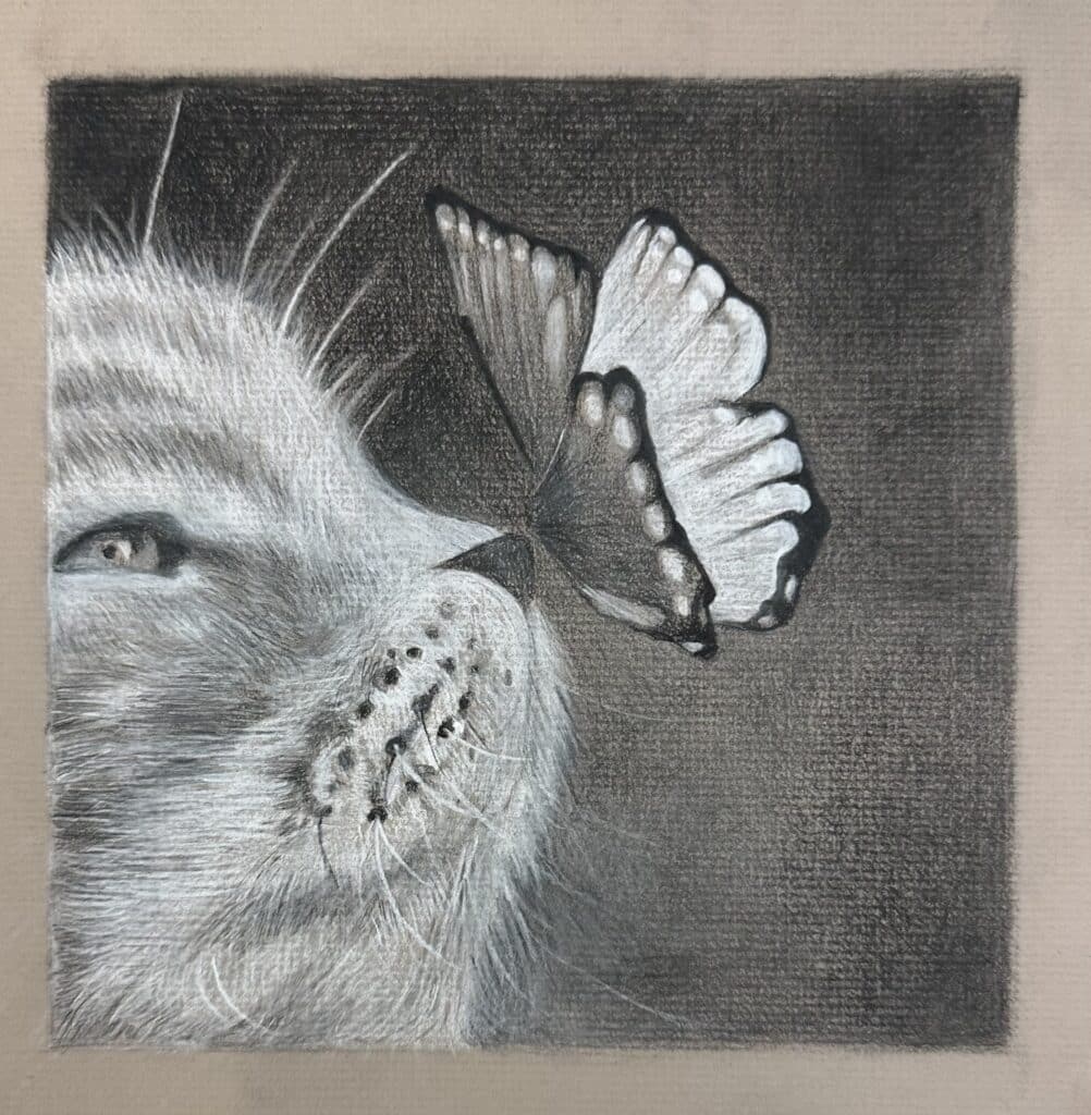
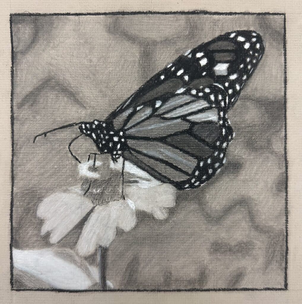
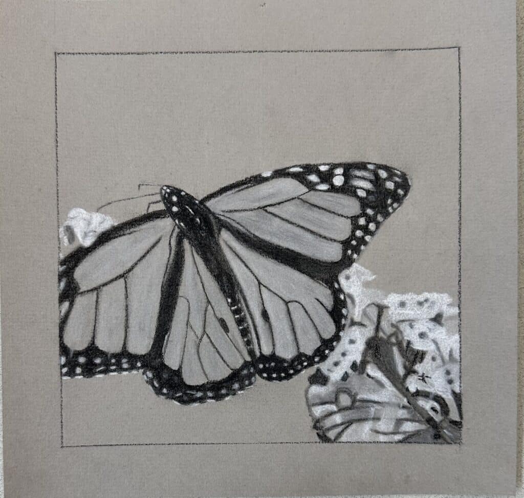
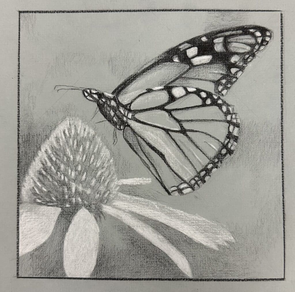
Butterfly Drawing Art Lesson Examples
More Charcoal Drawing Lesson Ideas for High School
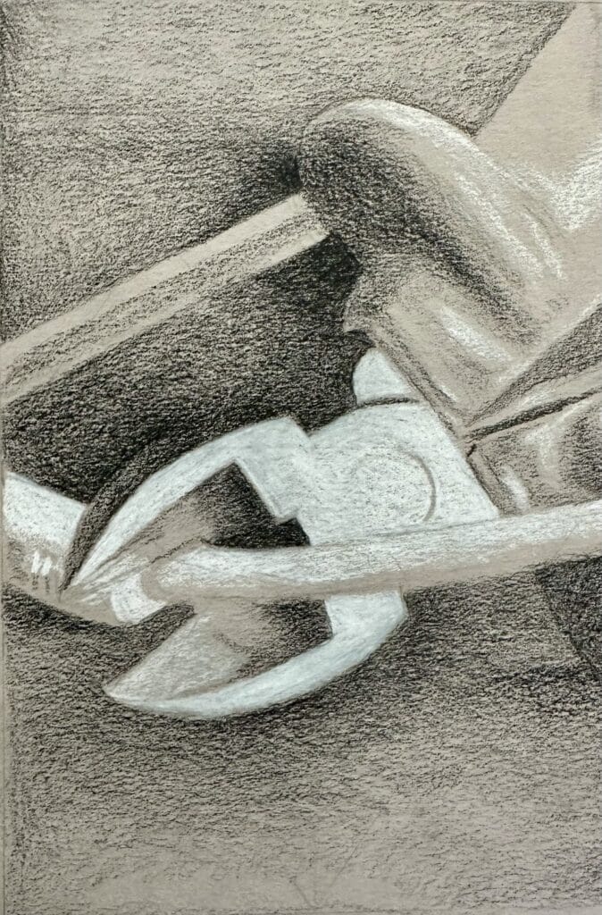
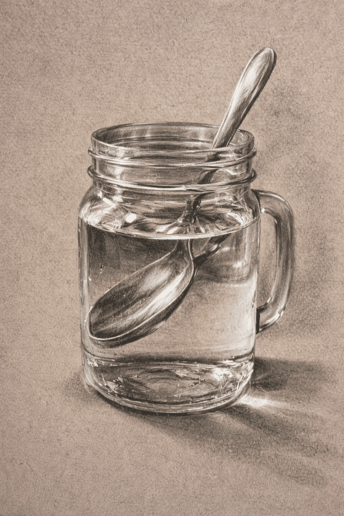
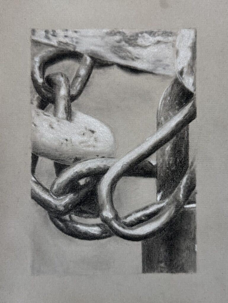
Metal and glass subjects lend themselves to high contrast. They look great drawn on gray or toned paper with black and white charcoal or colored pencil. Below are some examples of other high school art projects and still life drawing lessons that focus on value and shading. You can learn more about each one by clicking on the images.
Easy Art Project Ideas Using Charcoal
This drawing a galaxy on black paper lesson is an easy art project idea for high school beginners. It follows a graphite on white paper lesson. High contrast drawing on black paper with simple subject matter is an easy drawing project for high school beginners.This is a great beginner charcoal drawing on black paper lesson idea.
You can find this complete “Drawing and Shading: Butterfly” lesson with reference images, slideshow, video demonstrations, practice worksheets, handouts, rubrics and more in my resource shop!
What’s included in this lesson? In this complete resource you get:
✅An editable 29 slide Canva slideshow with step-by-step guidance
✅A video demonstration showing each step of the art lesson
✅30 gridded and ungridded reference images to draw from.
✅An instructional handout with QR code students can scan to see videos and slideshow
Investing in your artistic journey is an investment in yourself. This lesson is designed to empower you with knowledge, boost your confidence, and enhance your creative expression.
Don’t miss out on this incredible opportunity to refine your skills and create captivating artworks that stand out. Hop on this artistic adventure today!
Be the first to know about discounts, freebies, and new resources!